|
|
1997—CoMMensa |
|
|
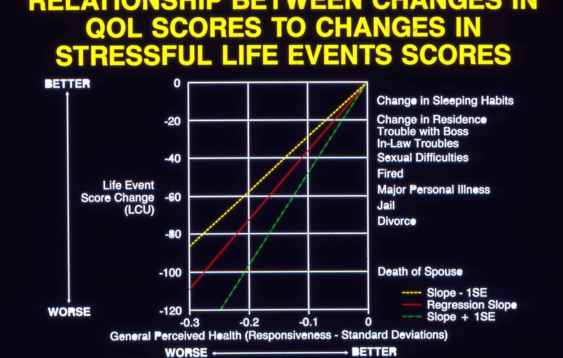
This DIA slide1 reflects the “new interpretation of quality of life data” that the
Christmas letter mentions. We were hoping it would make more people with lots of money want to spend it on us. It didn’t happen, or at least not fast enough to save CoMMensa from going out of business at the end of 2002.
We wanted to respond to a pervasive criticism of quality of life (QOL) research that its results were expressed in meaningless units. So, I analyzed a large amount of data that we had collected in several studies and produced this calibration curve. It translates (previously arbitrary) change scores on General Perceived Health into an intuitively-credible scale of increasingly-bad things that happen to people. Not sure when or where I displayed this slide to illustrate a talk. Probably several times. The graph appeared in our 1993 New England Journal of Medicine article. 1Please forgive the framing. Also the usage in the big yellow title. I’m embarrassed. |
|
Back a Page (CoMMensa) |
Such a Life Contents |
Chapter 3 (1958-1971) |
Chapter 4 (1972-2002) |
1996 1997 1998 |
Chapter 5 (2003-?) |
Next Page (Christmas) |
| Welcome | Stories | Sections | Such a Life | People | Places | Site Search | Do You Know? |
| Updated Jul 2020 | [1997p3.htm] | Page 497-04 |